Thursday, January 30, 2014

The return of Jewelry Wednesday! (...on Thursday night)

 Gotta give me points for trying, no?

I'm going to try to make Jewelry Wedneday posts more often, I think. I keep reminding myself that I actually made this blog because of jewelry- two years before I even got into nail art! Of course back then, I made about three posts and then forgot it existed for over a year. But I'm going to try to recapture the original intent of this blog by posting about jewelry every now and then.


Closeups and WIP shots after the jump!

Monday, January 27, 2014

Instagram!

Yes, after much hemming and hawing, I have jumped on the bandwagon. Instagram, I am in you! @fedoraharp over there too, of course.


I've been wary, because you can't put watermarks on instagram, and I'm rather attached to my watermarks. but here I am anyway!

I figure I'll be using it to post pictures of nails on days that I like my polish, but don't feel it's quite elaborate or unique enough to go on my blog. I'll also post in-progress art and jewelry, and maybe photos of things I've just bought... I'm still not 100% sure exactly what's going to be on there. But it'll be heavy on the nail polish and jewelry, I promise that!

I'm still trying to figure out how to connect it to my Facebook page. I can connect it to my personal Facebook with no problem, but I followed the instructions on how to connect to a page and it just... didn't work. If anyone has done this before, your advice would be appreciated!

Saturday, January 25, 2014

NOTD: Greyscale Chevrons

Hi all! Not much to say about this mani, so here it is:


Polishes used:
Rimmel- Grey Matter (light grey)
Ga-de- Black Orchid (dark grey)
Chic Metallix- Diamonds (silver)
Chic Metallix- Black Silver (black glitter)
Chic Metallix- Citrine Gold (gold accent)
Born Pretty Store Matte Topcoat

I'm really loving the flexibility and clarity that the camera on my new phone affords me. I can take good quality pictures in basically any lighting!

Tuesday, January 21, 2014

NOTD: First day of work

So! Starting a new job at a really professional company, being their youngest employee, I should make my entrance with something simple and mature, right?

WRONG!


Polishes used:
WOW Cosmetics- 304 (teal base)
Maybelline Colorama- 135 (purple base)
Glitterbunny- Don't Be Such a Guppy (glitter topper)

I actually got a work phone, and all of the photos have been taken with it. This camera is EXCELLENT! My previous camera was pretty decent, but the lighting had to be exactly perfect and you had to adjust the zoom a bunch of times. Here I can get the same results with much less hassle, which means I'm free to take pictures over the course of the day! Hooray!

I have more to write about, but it's pretty late here and I'm going to sleep. I do, however, have my next two posts planned out, so I hope you enjoy them!

Saturday, January 18, 2014

NOTD: Interview Nails 4 & 5- The grand finale!

Yes, folks, that's right! No more interviews for me! (For the time being anyway). I have officially signed with a new job, which I started a week ago.

The thing is, interview nails 4, while pretty, were nearly impossible to photograph. And interview nails 5, the ones I got the offer with, were tipworn and unimpressive. So I've lumped the two kinda mediocre presentations into one, to save space.

For the first mani, I matched them with a new pair of fingerless gloves that I absolutely adore- a soft grey with subtle sparkly threads woven into it. I really wish I'd been able to get better pictures of this, but my camera would just not cooperate. I tried a ton of different lighting, angles, and poses (with and without the gloves in case that was the fault), and I only came up with a couple of usable pictures:


Polishes used:
GA-DE Black Orchid (dark grey)
Indigo Bananas Pan (green-blue duochrome, but with matte only the green is visible)
Unnamed generic light grey

For my second mani, I was called in for the interview kind of last minute, and I still had the Ciate that I swatched from my 2013 roundup on. I had just done a bunch of polish stuff and didn't really have the energy to do anything elaborate, so I just stamped right over my swatch. I then proceeded to forget to take pictures for five days, hence the tipwear. (Really, what got into me though? I never leave polish on for five days!)


All things considered, it held up quite well! Since this just plain black on top of something I swatched just a few posts ago, I don't think I need to list the polishes for you :)

And thus ends the saga of the Interview Nails, at least for a good long time I hope! I've actually been at this job for an entire week already, so I have a bunch more things to share (like my first day of work nails and a few suprises!) But I'll be saving that for another post. My first week was pretty nuts, even just in terms of getting readjusted to 8 hour work days and waking up at a decent hour for transit. I'm hoping I'll manage to scrape together the energy to do multiple posts this week!

Friday, January 10, 2014

Swatch & Comparison: Pupa Winter collection multichrome

This polish is interesting, because it has neither a name nor a number (not really). It's part of the winter collection for Pupa Milano, and being one of four polishes, it's simply labled "001". The website calls it "Iridescent Silver", but it doesn't say that anywhere on the bottle.

At first glance, it looks like a dead-on dupe for Peace, Love, & OPI, which means two things. One, I needed it, and two, I needed to do a swatch + comparison post. Since this is a multichrome polish, it took me a lot of different angles to really capture the color, so fair warning: image heavy post! Swatches first, comparison after.

Artificial light:


Natural light:


Comparisons under the cut.

Wednesday, January 8, 2014

NOTD: Turquoise Nails

I make no secret of the fact that my favorite color is anything on the spectrum between blue and green. So what better nail art to do than the mineral embodiment of my favorite color, turquoise?


Warning: Image heavy! I put most of it under a cut, but I liked this design so much that I took a ton of pictures of it.


Monday, January 6, 2014

Guest post at Flight of Whimsy!

Hey guys! I put together a guest post for Eva from Flight of Whimsy a while back for when she was going to be abroad, and it just made it's way through her queue! Go check it out :)


Back over here, I want to tell you about a funny thing that happened while I was making the post.

See, since Eva is coming here to Israel, I decided to use the guest post opportunity to showcase some of my favorite Israeli polish brands. That means bottle shots, which I don't do very often. See, I don't really have a lightbox per se. I have a lamp and my harp stool with a piece of black cloth draped over it. Most of the time that works just fine for nail shots, but for bottle shots it's a little more complicated.

My cat makes it complicated.

I think Simon (my cat) might have a burrowing rodent somewhere in his ancestry. You see, any time there is an opportunity for him to hide under something, he runs towards it. Usually he ignores my lighting setup because it's on the floor, but when I moved it to my bed to get a better angle on the bottle shots, this happened:

(please excuse the mess on my bed! If I'd known the bed itself would end up in a post I'd have tidied it up a bit...)


Which meant that any time I tried to place polishes in any kind of neat formation, the little bugger stuck his paw out from under the cloth and knocked them over! I eventually got a decent enough shot of the bottles, but man, who knew having a cat would affect my blogging this much? :P

Wednesday, January 1, 2014

2013 Roundup

Good morning 2014! Nice to meet you, I hope we have fun together!

I figured right around now would be a good time to look back and see if there was anything interesting over the last year or so.

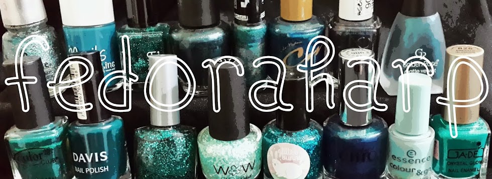
So, let's start with my 10 favorite new polishes in 2013 (in no particular order):


WOW 427- This dries to a satin-y kind of finish, but it looks even more stunning fully matte. I love how unique it is, it's like a blue jeans color. It is also impossible to photograph. I had to play with dozens of combinations of settings and lighting to get it to look right. For some reason my camera kept reading it as a much brighter blue.


Ga-De Gold Sugar- And really, texture polishes in general this year. I'm not a gold person usually, but this one really blew me away.


???- 104- I'll be honest, I don't know what this brand is called. The bottle just says "Mirror effect" on it, and the other finishes from this brand all just have the name of the finish too. But I have a few of them, and they all look pretty awesome.


Autodidact- Not to toot my own horn here (well, technically yes), but I've been playing around with frankens, and I'm really quite happy with how some of them turned out! I would love to try out mixing polish from scrap, maybe this year I'll pull together the funds to actually buy supplies!


GlitterBunny- You Can Do It, Brucey!- Speaking of Indie polish, GlitterBunny! I have never bought indies before, and now I have a bunch from  GB and Indigo Bananas. I use this one constantly, it's an awesome glitter topper.


Born Pretty Store Holos- 12- This year also marks the year I could finally start ordering stuff online. And look at this sucker! Both the color and the holo quality are amazing.


Ciate- Beach Hut- This one scrapes in just under the wire, I bought it on December 29. I know Ciate has shown a really crappy attitude towards bloggers (with the "caviar nails" fiasco and all that), but I couldn't resist this glowy glittery orange.


Orly- Star Spangled- My picture doesn't even come close to doing justice to this incredible polish. It's a beautiful red jelly packed with microglitter, and it has incredible depth and finish. Basically, it's amazingness in a bottle. 


Inglot- 202 and 203- This one is a tie, because I couldn't choose between these two incredible duochrome flakie toppers. I mean, just look at them! (this time I do think the picture did them justice. I'm usually terrible at catching color shift but this one was nice and cooperative)


L'oreal Paris- Mysterious Icon- Last but not least, a brown-gold-taupe-indefinable-SOMETHING that seems to not quite fit into any category. It even has purple undertones, to make things more confusing. I love that I can't quite quantify this.

Since most people get bored once the photos end, the rest goes under a cut!
Related Posts Plugin for WordPress, Blogger...